

Hallmark and Impeccable are a near tie at the top. Everything else is far behind.
Every week someone shares a new “make Claude design like a pro” skill. So I ran a real test. Same brief, same model, one fresh agent per skill, plus one build with no skill at all. Then I scored every page on my own rubric, built from my gut-feel ranking of the six builds and what I liked and disliked. An agent applied that rubric to the saved screenshots, and I corrected a few scores myself.
The short version: Hallmark (95) and Impeccable (92) pulled far ahead. Treat that 3-point gap as a tie. frontend-design is a clear third at 64. UI/UX Pro Max (56), Taste Skill (52) and plain Claude (51) sit together at the bottom, and those gaps are noise. My earlier first-pass ranking had Impeccable alone on top; once I scored against what I actually cared about, Hallmark moved up beside it.
Hallmark (95) and Impeccable (92) pulled far ahead of everything else.
What are Claude skills?
Claude skills are folders of instructions, scripts and resources, with a SKILL.md file, that Claude or Claude Code loads when a task matches. Design skills steer typography, layout, motion and brand choices, so the agent builds a UI with a stated taste instead of generic AI defaults.
A skill is just a folder with a SKILL.md like this (simplified example):
---
name: my-design-skill
description: Use when building or restyling a web UI. Sets typography, color and motion rules.
---

# My design skill

- Pick one accent color and use it for every button.
- Use two fonts at most: one for headings, one for body text.
- Keep animations under 300ms and respect prefers-reduced-motion.
New to Claude skills? Start with my earlier article, 10 Best Claude Skills. It explains what skills are and how to use them. This one goes deep on design only.
Quick pick
Hallmark, 95/100: brand-first, calm, closest to a real product site
Impeccable, 92/100: the most alive page, and the only build that passed every requirement check
frontend-design (Anthropic), 64/100: a safe, readable default
UI/UX Pro Max, 56/100: richer quiz motion on a template layout
Taste Skill, 52/100: bold originality, hurt by all-caps type
No skill (baseline), 51/100: fast and cheap, and close to the three above
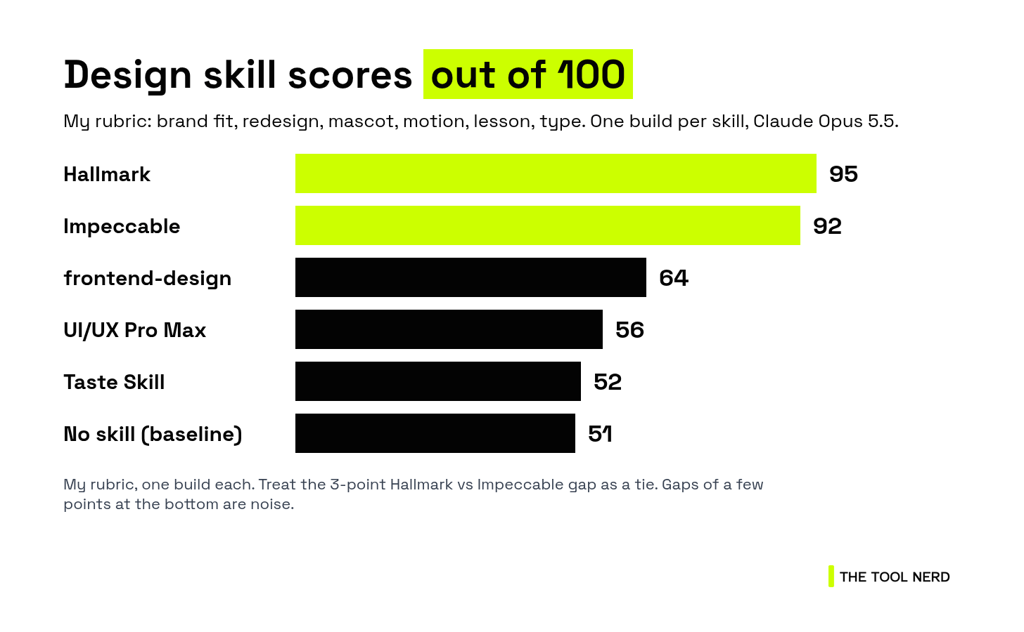
One honest warning before the list. I built each page once. Design output changes a lot from run to run, so treat the Hallmark vs Impeccable gap as a tie, and treat the gaps among UI/UX Pro Max, Taste Skill and plain Claude as noise. The gap between the top two and everyone else is large enough to rely on.
How I scored them
This is my rubric, not a generic design checklist. Weights sum to 100:
Brand fit and clarity (25): feels like the brand and communicates cleanly
Real redesign (15): a distinct concept, not a shared template
Mascot character (20): cute, styled, feels like a character
Motion and transitions (15): how alive the animation feels overall (owl, quiz, transitions)
Lesson showcase (10): shows the product working, with room to breathe
Typography (15): fonts suit the brand and read well
Each criterion is scored 1 to 5, then weighted. Totals are out of 100.
The brief
Every agent got the same brief, word for word. This is the exact prompt:
Create a playful single-page marketing site for Aryan (helloaryan.com), an AI tutor that teaches out loud and draws on a whiteboard or chalkboard as it explains. Tagline: "learn anything, out loud". Use plain HTML, CSS and vanilla JS (no framework, no build step), one folder per run, with index.html as the entry.
Required:
- A Chalky Owl mascot (draw it as inline SVG) that follows the cursor with its eyes, blinks at random intervals, points a wing at whatever is hovered (buttons, cards, the quiz), and reacts to clicks (hop, spin or squawk bubble).
- Animated buttons (hover, press and focus states).
- A "Quiz me" widget with 3 questions. A correct answer triggers a celebratory animation (confetti or chalk sparkles) and the owl cheers. A wrong answer triggers a gentle shake and a hint.
- A voice-wave animation on the mic button (idle pulse, active waveform when clicked, with a start/stop toggle).
- Light (whiteboard) and dark (chalkboard) theme toggle.
- Sections: hero, how it works (3 steps), sample lesson card ("Why we have seasons"), quiz, footer with a call to action.
- Accessibility: respect prefers-reduced-motion, visible focus rings, AA contrast, working keyboard navigation, alt text and ARIA labels.
- Responsive from 375px to 1440px.
Look at https://helloaryan.com first for tone and branding. Do not copy its code.
Hard on purpose: lots of motion, lots of personality, and it still has to work on a phone and with a keyboard.
Here’s how all six looked on desktop, A to F, left to right:
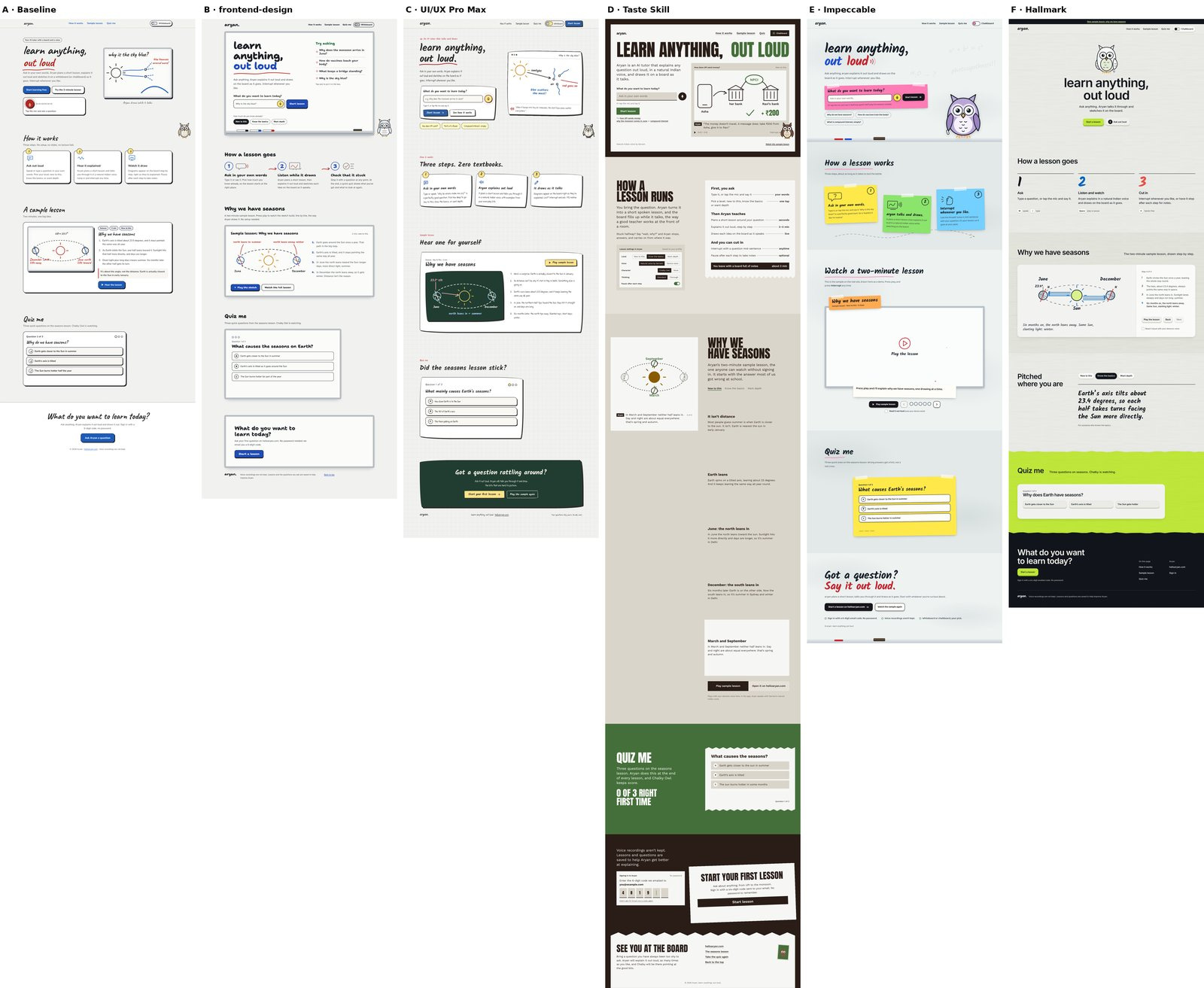
A is no skill, B is frontend-design, C is UI/UX Pro Max, D is Taste Skill, E is Impeccable, F is Hallmark.
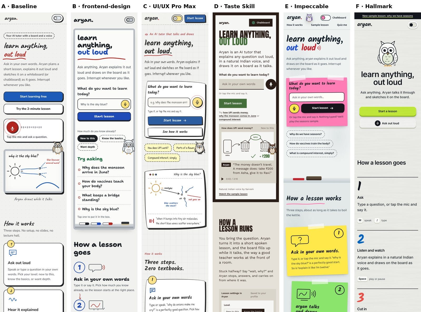
Mobile, A to F. Look at where the owl sits: over content in A to D, in the header in E, clear in F.
1. Hallmark: 95/100
What it is: a skill focused on brand-true, restrained, editorial design.
GitHub: nutlope/hallmark · 47,077 stars · MIT
What it changed vs no skill: it was the only build that used the actual lime from Aryan’s real site. Light grey, lime quiz band, lime buttons, spare centred hero with a large round owl. Along with Impeccable, its owl stayed clear of content on mobile. Clean lowercase headings (with the Kalam font for accents) and big hand-drawn step numerals.
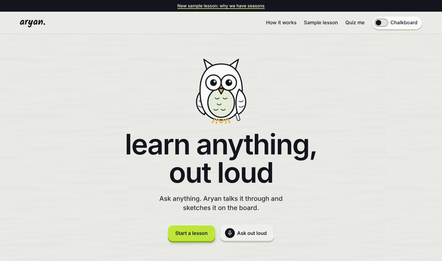
Hallmark’s hero page, desktop.
Hallmark, 26-second recording of the build.
Strengths:
Best brand fit and typography of the six (both 5/5)
A real redesign, not the template skeleton that A, B and C share
Large, cute owl that keeps its character at small size
Owl reactions, wing flap and step-by-step lesson drawing all work
Weaknesses:
On scroll the owl jumps into the corner in one frame instead of sliding (that cost it the motion lead)
Wing pointing only covers the quiz and theme toggle
Wrong-answer shake is barely visible
Intended heading font (the Chillax font from Fontshare) was blocked in my setup, so headings rendered in a fallback system sans. The type score is for what I actually saw, which is the version I liked.
13m 10s and 252,665 tokens
My verdict: my pick when brand comes first. Calm, on-brand, and far ahead of the middle of the pack. The 3-point edge over Impeccable is a tie in practice.
2. Impeccable: 92/100
What it is: a design skill that makes the agent write a product brief (PRODUCT.md) before building, a DESIGN.md after, and review its own screenshots as it goes.
GitHub: pbakaus/impeccable · 101,648 stars · Apache-2.0 · Impeccable in the directory
What it changed vs no skill: a far stronger mascot and a livelier page. The owl was a big co-star next to the headline. It hopped when clicked and cheered with happy closed eyes on a correct answer. Its screenshot review loop caught the owl covering content on phones and moved it into the header. On scroll, the owl slides through 9 sizes, from 317px down to 118px, into the corner. Once you press play, the seasons lesson fills most of the screen.
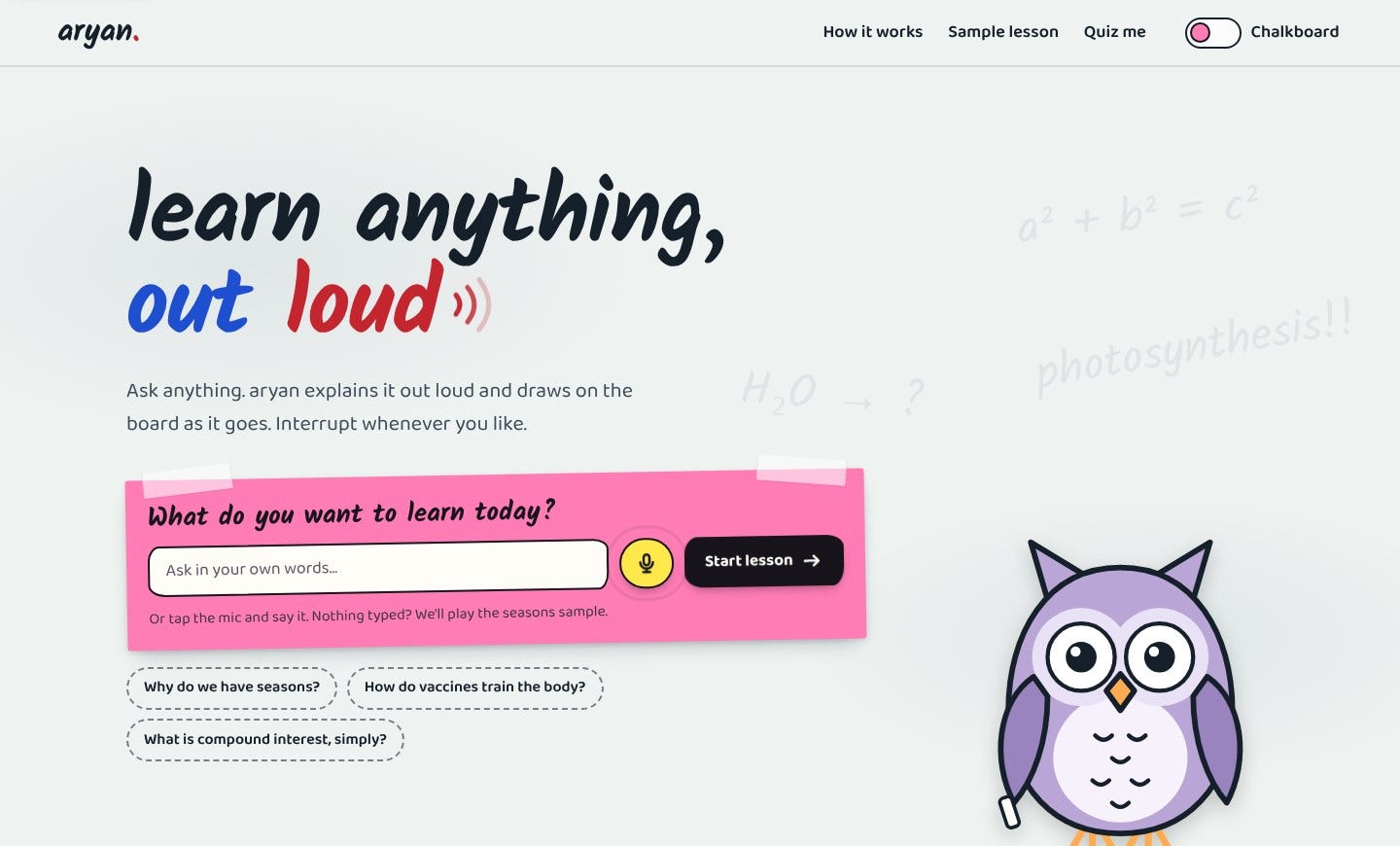
Impeccable’s hero page, desktop.
Impeccable, 25-second recording of the build.
Strengths:
Only build that passed every requirement check
Best motion and best lesson showcase (both 5/5)
Sticky-note steps, clear wrong-answer shake, zero accessibility violations, proper reduced-motion version
Weaknesses:
Palette went pink and purple, not the brand’s lime. The owl is purple, not chalky.
Type is warm (Kalam and Baloo 2 fonts) but a little busier than Hallmark’s calmer look
Slow and expensive: 16m 32s and 241,554 tokens, versus 6m 10s and 128,305 for no skill
My verdict: the most complete, alive experience of the six. Install it when you want the page to feel designed end to end, then check its colours against your brand.
3. frontend-design (Anthropic): 64/100
What it is: Anthropic’s own design skill, from the official skills repo.
GitHub: anthropics/skills (folder skills/frontend-design) · 187,152 stars for the whole repo · the GitHub API shows no repo-level license; the skill folder ships its own Apache 2.0 LICENSE.txt
What it changed vs no skill: a more deliberate concept on the same skeleton as the baseline. The hero became a framed whiteboard with a marker tray. The three steps sat on one strip joined by hand-drawn arrows. The mascot is a crisp outline owl that blinks, points, hops on click and cheers with both wings up. Motion (hop, cheer, sparkles, card shake) is lively. The owl stays fixed in the corner when you scroll.
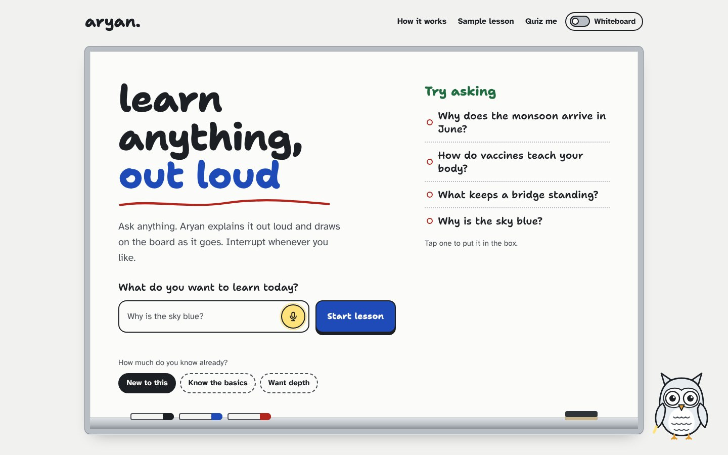
frontend-design’s hero page, desktop.
frontend-design, 25-second recording of the build.
Strengths:
Clear third place, well ahead of the bottom cluster
Readable body text (Atkinson Hyperlegible font)
Coherent board metaphor, and a good dark chalkboard version
Zero accessibility violations
Reasonable cost: 10m 40s, 148,582 tokens
Weaknesses:
Still shares the baseline template skeleton (redesign scored 2/5)
Blue and red palette, not lime
On mobile the owl overlaps content
Lesson is still a card within the page
My verdict: the safe default. Not in the Hallmark/Impeccable tier, but the clear pick when you want something sensible that won’t go weird.
Halfway through the guide. If this is saving you a few test runs of your own, subscribing is free and the next test lands in your inbox.
4. UI/UX Pro Max: 56/100
What it is: a large design-system skill with palette, font and style suggestions.
GitHub: nextlevelbuilder/ui-ux-pro-max-skill · 144,817 stars · MIT
What it changed vs no skill: much the same layout as the baseline, on a grid-paper background, with a heavier hand-drawn style and richer animation. A visible burst of chalk stars on a correct answer and a long animated mic waveform.
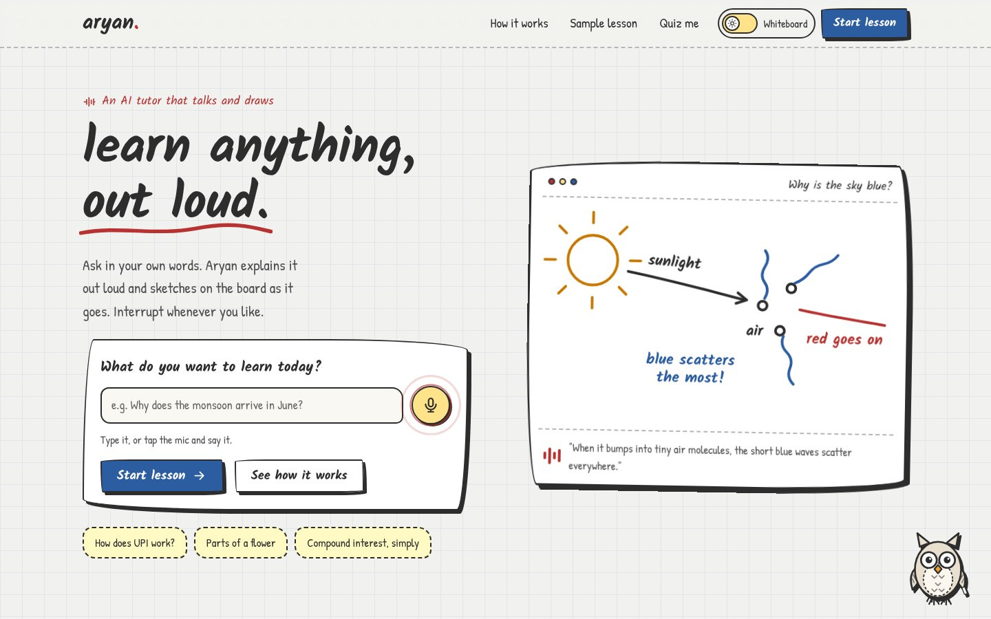
UI/UX Pro Max’s hero page, desktop.
UI/UX Pro Max, 28-second recording of the build.
Strengths:
Strong quiz celebration for a template-style build
Charming sketchbook feel
Zero accessibility violations
Weaknesses:
Same skeleton as baseline (redesign 2/5)
Yellow/pink palette with a dark-green CTA, not lime on grey
Small outline owl that overlaps content on mobile
Handwritten fonts in body text hurt longer reading
8m 33s and 167,474 tokens
My verdict: skip unless you specifically want that sketchbook motion. The score gap to Taste Skill and plain Claude is noise.
5. Taste Skill: 52/100
What it is: a skill (design-taste-frontend) that picks a bold art direction for you with its own direction script.
GitHub: Leonxlnx/taste-skill · 109,554 stars · MIT
What it changed vs no skill: a completely different editorial look. Poster-scale condensed headline, zigzag “stationery” sections, green quiz band, and a lesson that plays as you scroll. Most original of the six, and the least on-brand.
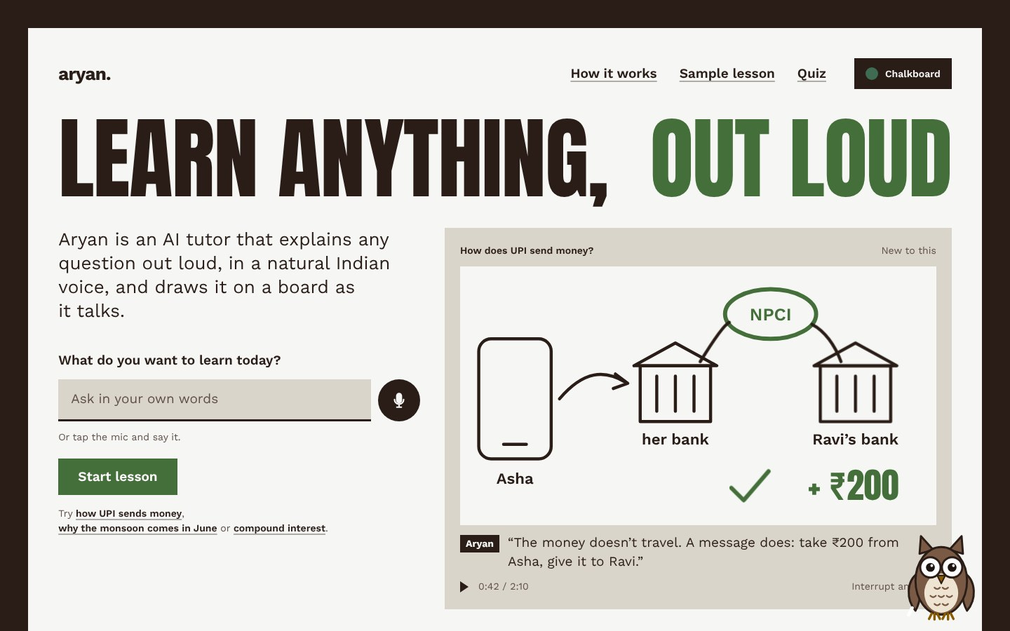
Taste Skill’s hero page, desktop.
Taste Skill, 26-second recording of the build.
Strengths:
Real redesign (5/5): a distinct poster concept, unlike A, B and C
Filled brown owl with more character than the outline owls
Weaknesses:
The Anton font in all caps for the hero (”LEARN ANYTHING, OUT LOUD”) killed the type score (1/5)
Dark brown / khaki / forest-green is far from lime on light grey
Little animation; celebration sparkles last a fraction of a second, no cheer pose
One axe accessibility issue, and 2px of sideways scroll at 375px from the mic pulse ring
Owl overlaps content on mobile
Most expensive run: 17m 11s and 256,206 tokens
My verdict: fun if you want a surprise and don’t care about brand. For a real product page, I wouldn’t. The all-caps type is what sunk it.
6. No skill (baseline): 51/100
This isn’t a skill, but it’s the most important row. It’s what plain Claude did with the same brief.
What it did: a clear two-column hero, playful handwritten headline with plain sans body text, confetti on a correct answer, and every mascot behaviour the brief asked for. Zero accessibility violations. Fastest and cheapest run (6m 10s, 128,305 tokens).
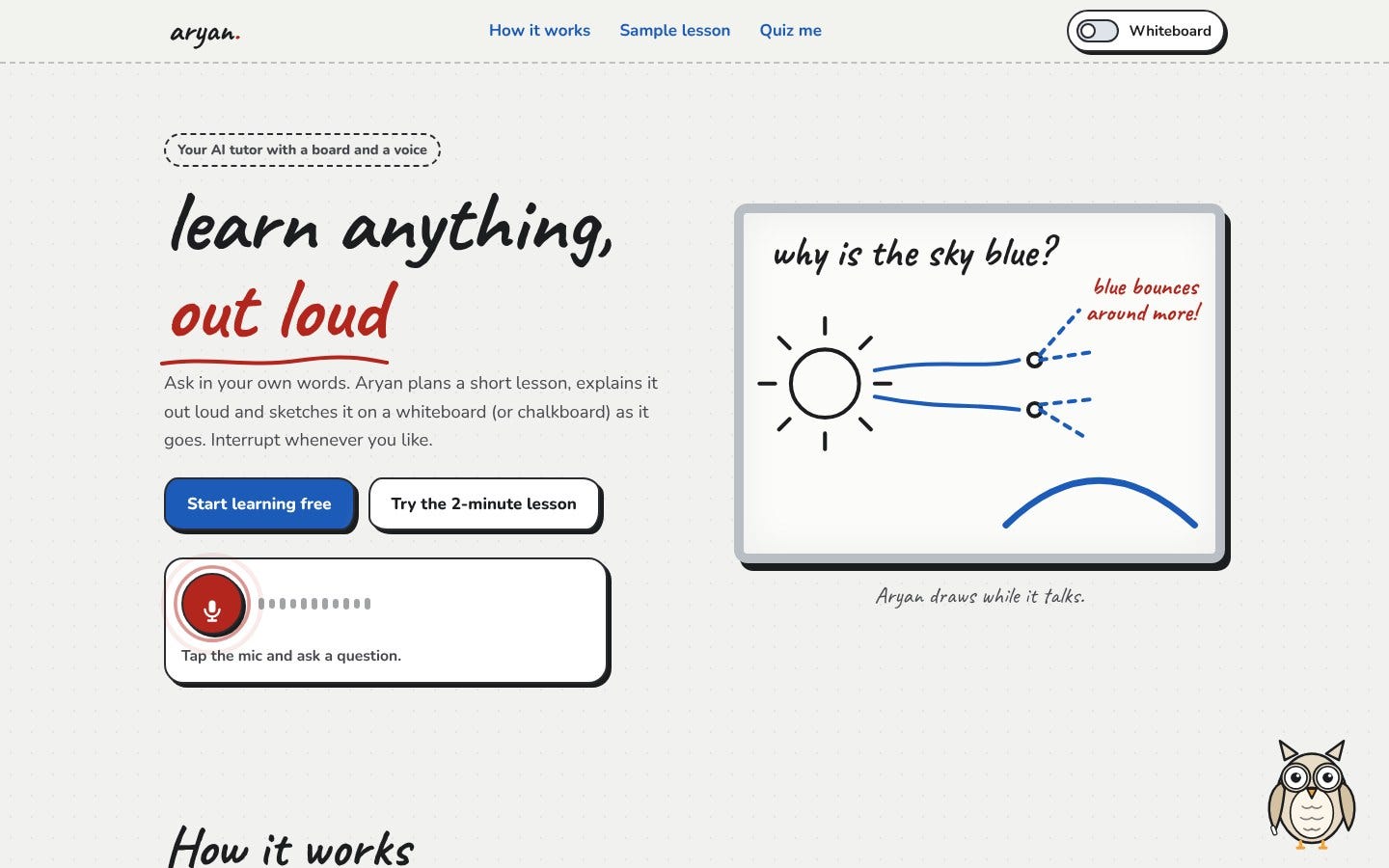
Baseline (no skill) hero page, desktop.
Baseline, 26-second recording of the build.
Weaknesses: the template skeleton that B and C share, blue accent instead of lime, small outline owl that’s easy to miss, lesson sketch about 230px wide on a 1440px screen, owl covering content on mobile.
My verdict: any skill that doesn’t clearly beat this isn’t earning its tokens. UI/UX Pro Max and Taste Skill barely do. Hallmark and Impeccable do by a mile.
How I tested
I want to be upfront, because “I tested” can mean a lot of things.
Model: Claude Opus 5.5 for every build.
Fresh agent per skill: each build started in an empty folder with no shared context, and got the identical brief.
Not a real install: each agent was told to read and follow only its own skill folder (pinned to a commit from Nov 3, 2026). That’s close to a
/plugin installin a fresh Claude Code session, but it isn’t one.Same capture scripts for every build: screenshots at desktop and mobile in light and dark, a scripted recording, a slow scroll recording with the owl’s position measured every 50ms, frames of each lesson while it plays, and an automated accessibility check (axe) in both themes.
Who built and scored: the same model family built and scored the pages. Every score cites something visible in the captures.
Sample size: one build each. Treat Hallmark vs Impeccable as a tie. Treat the bottom three gaps as noise.
My recommendation
Brand-first calm sites: Hallmark.
Most alive / most complete experience: Impeccable (only build that passed every requirement check). Then fix its colours to your brand.
Safe default: Anthropic’s frontend-design.
Skip the rest unless you want their specific style. Taste Skill is bold originality with type that fights the brand. UI/UX Pro Max adds sketchbook motion on a template. Plain Claude is close enough to both that you should try no skill first before spending the tokens.
The real lesson: a design skill is a set of opinions. Pick the one whose opinions match what you’re building, and still look at the result yourself.